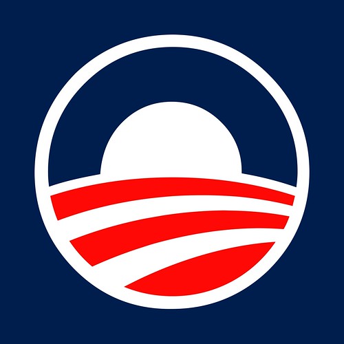
We have a Recovery Act project going on in our town. When I first saw the logo, I figured it was just my paranoid right-wing mind that thought it oddly suggestive of the Obama 2008 campaign logo. And I was driving by quickly, so I didn't get a decent look at it.
Tangent: You'd think New Hampshire would be just full of these things. The primary season will go into full swing right after the Nov 2010 elections, so maybe they're holding off until then. /tangent
So I went to look up both logos to see if it was just fevered imagination, and found that I'm not the first person to think this. A writer at the LA Times thought so too. In fact, both logos are designed by the same company. They aren't hugely the same - not communist dictator the same - but the Recovery Act logo, especially when driving by at a good clip, sure seems evocative of Obama's campaign logo.

4 comments:
Hmmm... I'm not seeing it. Except for the fact that it's circular, and that there's a line dividing it in half horizontally (a wavy line for the Obama logo, a straight bisection for the ARRA logo). And that's not much resemblance.
On the other hand, this alternative logo bears no resemblance. ;-)
Have you seen the Michelle Malkin version?
http://michellemalkin.com/2009/05/18/your-stimulus-dollars-at-work/
jaed, my only counter would be that such things work better if they only evoke, not declare their connection. Obviousness would be a liability. I think that's what this does. I admit, however, that this gets into very fuzzy territory.
So any circle with a red white / blue vector feel will have the Obama logo feel. Obama did a great job at marketing his logo and thus we will see it in any circular logo...
Post a Comment